Relola Agent: Mobile App
I joined the very dedicated team of 14 employees at Relola in a two-month project to help Relola motivate its current users, who at the time were Real Estate Agents, who wanted to take small actions, on a regular basis, that could help them expand their client base and secure more sales. The Co-Founder of the company had seen the work that me and my former colleagues had done for IdentityForce to increase their user engagement and motivation in using IdentityForce’s App and hired me as their first UX Designer to do the same thing for her young company. This was one of Relola’s potential investors’ requirement before they would invest their series A funding.
Within those two months, I used the secondary research done by the marketing team at Relola to learn more about Relola’s primary users and conducted Stakeholder interviews to understand the business model and their primary goals. Through heuristic evaluation, I was able to understand users’ pain points and frustration and created wireframes that would improve the user experience. I then conducted a series of usability testing by observing the users interact with the current App and then use the prototypes I had created and compare the two together.
I then improved the user interface and created high fidelity mockups based on the feedback I had received from users and Relola’s product team. Upon launching the new version of the App, we were able to increase the number of our users as well as the number of insights that each user would create and publish on Relola’s Native Apps.
Relola iOS App
Selected Screens
Research:
Who is Relola and what’s up with the unicorn?
Founded in 2015, Relola is a content-creating tool, mostly used by Real Estate Agents, which showcases their activities and expertise in the areas they are most active. By using Google’s API, Relola allows its users to curate the moments and the places that matter to them by dropping pins on the map and adding their comments, pictures, or videos. The users then can share their curated maps on social media for their friends and family, and in the case of Realtors, their clients, branch managers, and brokerage to see.
The founders of Relola had so much belief that their company was soon going to be among the “Unicorn Startups” that would take up, due to the success of their product, that they chose the unicorn as their mascot. Later unicorn became a part of the company’s branding as a fun, playful, and magical product.
In December 2016, after Relola was introduced as a useful tool for the modern Real Estate Agent at the National Association of Realtors® (NAR) conference in Chicago, IL, over 18000 downloaded the App. However, within a year, in any given month Relola had less than 500 active users. I was brought in to help increase that number in addition to the number of insights that each user would publish in a month.
Challenge
How might we improve Relola's products to increase users engagement and create a larger customer base?

Hypotheses
Through gamification and easy to follow steps, we can create motivation and provide knowledge to empower our users in sharing their expertise in order to attract new customers and expand their business.
Interviews
Stakholder Interviews
I knew very little about the Real Estate industry but was very eager to learn as much as I could as quickly as I could in order to help Relola succeed in increasing its user engagement and sealing their first round of funding. I conducted 9 rounds of interviews, in which I asked the stakeholders various questions about their business model, what type of users we had and if that was different from the type of users they were planning to target. I also asked them to describe the characteristics of Relola’s main users, their pain points, and the goals they each had.
Voice of Customer Channel
I then interviewed Relola’s customer service and marketing team and asked them about their experience in interacting with the customers, any patterns or characteristics they might have witnessed, and the most common pain points that they think we should focus on resolving first. I also asked them to share any previous research they had done that could help me learn more about the Real Estate community and the type of Agents Relola was targeting on the App.
To my surprise, we only wanted to target the top 20% of Real Estate Agents, as they are the ones who are actually making a profit in their profession, usually meeting their sales quota, and are highly motivated in using any tools that can help them get there. This demographic is mostly Caucasian women between 35 to 55, and in spite of having a lot of similarities with sales executives, they are not necessarily very tech savvy. They like to follow easy and simple steps and tutorials and are very open to listening to their mentors, coaches, and the leaders in the Real Estate community, including Tom Ferry, who is also known as Tony Robbins of the Real Estate industry.
One of the patterns that our customer service had seen when interacting with Relola’s users was how protective they were of their territory and their knowledge. They had a fear of sharing their knowledge and insights on the App and to the public before they had made the sale. Most mid to senior level Agents were intimidated by the “millennial agents” and their ability to use social media in their advantage and were not comfortable documenting all their knowledge on the App for the millennial agents to easily grab.
Behavioral Analysis
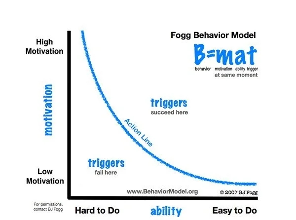
Based on my secondary research and interviews, I found out, like Sales Executives, most Real Estate Agents, had a certain routine and go-to techniques that they would rely on which could make or break their careers. I knew that breaking habits or adopting new habits is not easy, but studies show that people can still change.
BJ Fogg’s Behavior Model suggested that three factors have to happen at the same time in order for people to change a behavior:
1) They need to be motivated
2) They need to have the ability to do the task they need to do
3) They need to be triggered to perform the behavior
My research suggested that if we connect the new behaviors that we want our users to adapt to their values, more people would be motivated to try those behaviors that could eventually turn into long-lasting habits.
IdentityForce Mobile App
Behavioral Analysis - BJ Fogg's Behavior Model
Heuristic Evaluation
At a quick glance, I could empathize with the Real Estate Agents that would feel overwhelmed upon logging into their Relola App. When they opened the App for the first time, they would see three welcome screens with marketing messages that were initially designed as part of printed collaterals when Relola was first introduced to the Real Estate community at the National Association of Realtors® (NAR) conference in 2016 in Chicago, IL.
While the exposure at the conference was a success and it opened a huge door of opportunity for Relola, the same messaging was not applicable to the first-time users on its App, mainly because when users install Apps on their phones, they are already sold on the idea of exploring and giving the App a try. What can then have a big impact on their decision in terms of using the App regularly or abandoning it altogether is whether the App is easy to use and can make their lives easier or not.
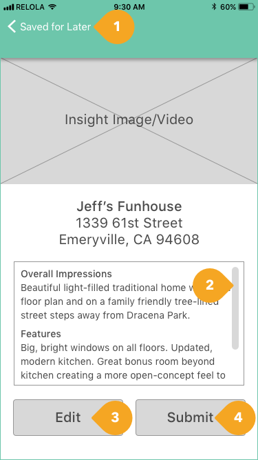
During my research and usability testing, I learned that a big percentage of Relola’s first-time users were struggling with the App and did not know how to use it the first time they opened it. To the first-time users, it was not clear what the App does, how they could interact with it, and what was the value proposition of using Relola. Besides, the three welcome screens were not providing any new info to the users. In my opinion, we were missing the huge opportunity of giving first-time users a tour and showing them how easy it was to engage with the App. After improving Relola’s main App screens, I used this section to give a Bubble Tour of Relola’s improved App to all the users that would download or update the new version of the App.
Relola Agent’s Old iOS App Screens
Usability Testing
During our usability testing, we realized that most Realtors liked the idea of using a new tool that would feature them as “local experts” in the areas they were most active. However, like any sales executive, they tend to not want to talk about their leads until they had sealed the deals, which was the opposite of what Relola wanted them to do on the App.
As a UX Designer, I was able to empathize with the Realtors and their concern that any new Realtor on the App could see, read, and use their insights and knowledge in order to compete with them and beat them at their own game, which is why I relayed their concerns to the founders of Relola with the hope that they would find a way to address such valid concerns. I then focused on addressing the users’ confusion upon opening the App for the first time.
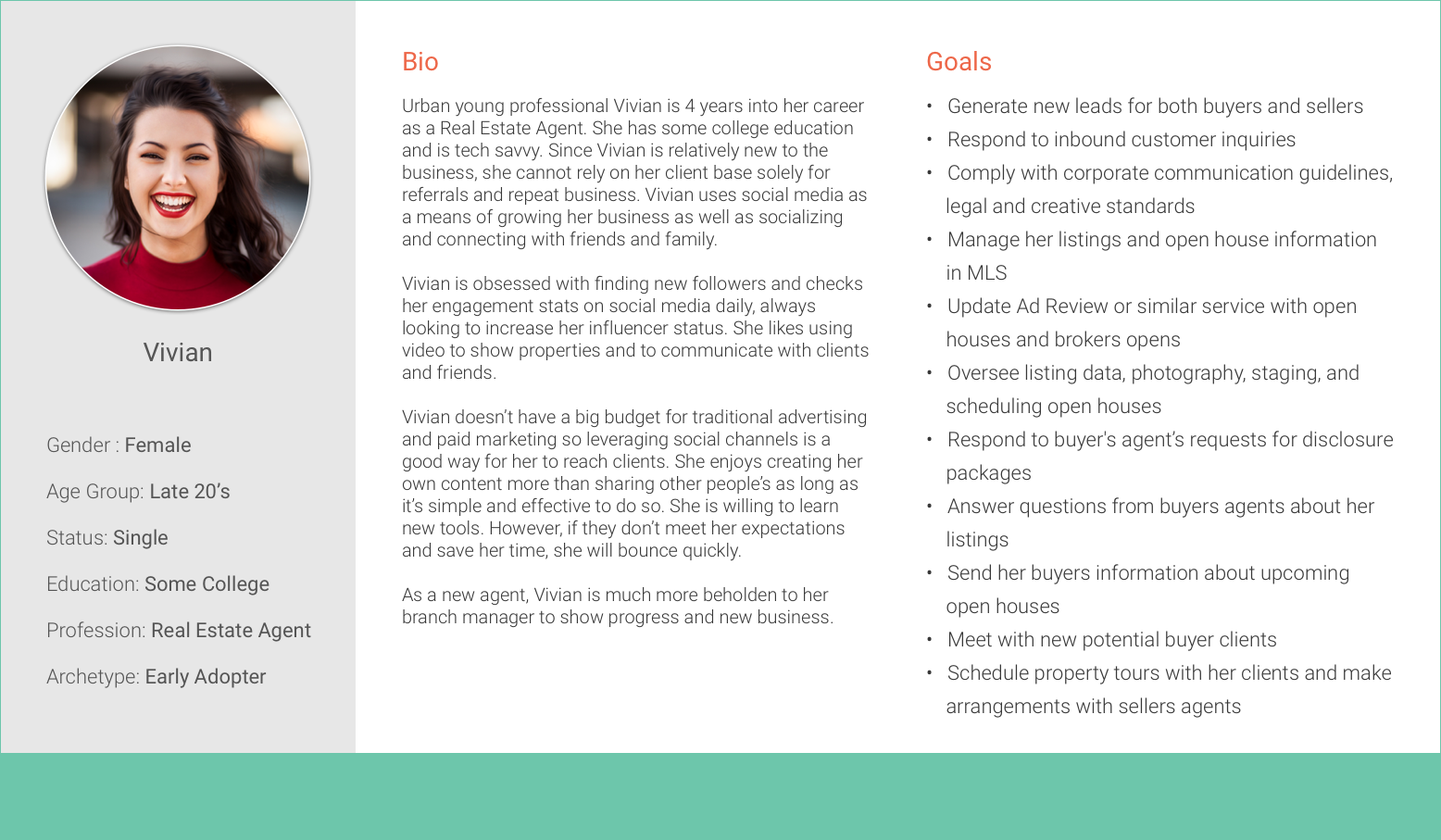
Personas
I used the insights from stakeholder interviews and our voice of customer channel to validate and update previously created personas and focused on meeting the needs of our primary personas, who were Real Estate Agents using our App:
Primary Personas:
Relola’s New & Improved Native Apps
Features
During the company-wide user engagement workshop, when all employees flew to our headquarter in Emeryville, CA, to listen and participate in multiple workshops in order to understand Relola’s business and customer goals and hear about the company’s vision in the new year, I gave a Lean UX lecture and hosted a brainstorming exercise, in which I asked my colleagues to write down any features that they would think can help our main personas achieve their goals while using our Native iOS and Android Apps. At this point, we are were all briefed in the company’s previous research, Relola’s typical users, and the personas we wanted to target for the first half of the year.
Minimum Viable Product (AKA MVP)
I then put the suggestions on a feature prioritization matrix in order to decide on a minimum viable product (MVP) that would meet both users and business needs.
Paper Prototypes
I started putting together paper prototypes to run by our Dev team and start the conversation of how much flexibility we had when it came to using Google API and Native App components, what can and should change and what needs to stay untouched. I also wanted to know if the solutions I was proposing were possible to build and get a better sense of any technical limitations I needed to be aware of.
Wireframes & Usability Testing
After receiving feedback from the Dev team, I created digital wireframes in Sketch and conducted my second series of usability testing comparing the current App with the new wireframe proposal.


App Store Screens
To create a friendlier image of Relola Agent’s App, I created these series of 5 screens, which also promoted the App by telling Relola’s story better on the App Store.
Relola Agent’s App Store Screens
User Interface
Once I gathered our insights from usability testing, it was time to move to high fidelity mockups on Sketch. I chose Material Design as the style for our User Interface in order to create a similar user experience and look and feel on both Android and iOS Native Apps with the exception of using each platform’s native iconography and components when it was necessary.
UI Experiments


Final Mockups


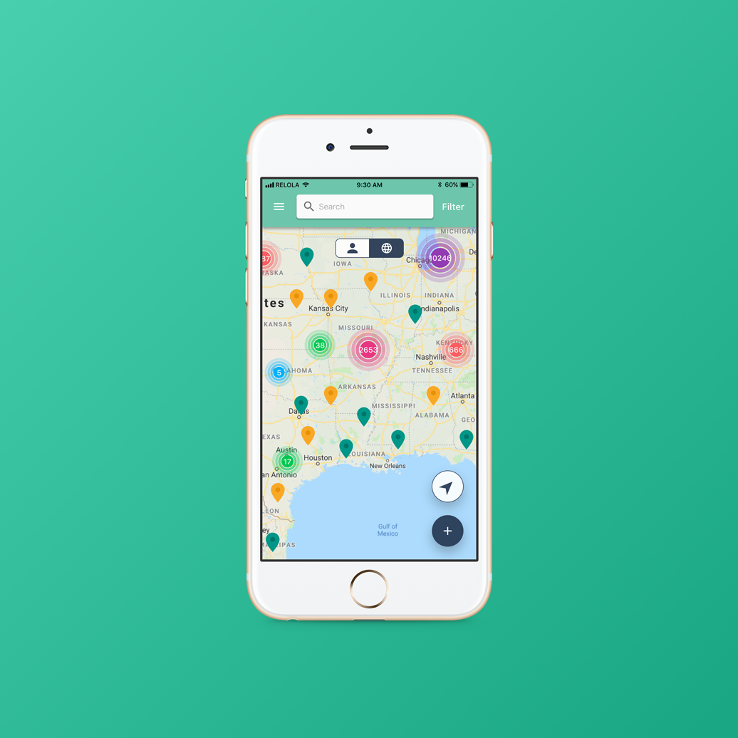
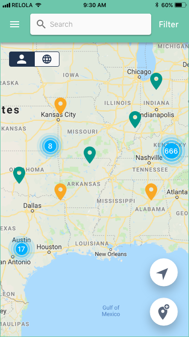
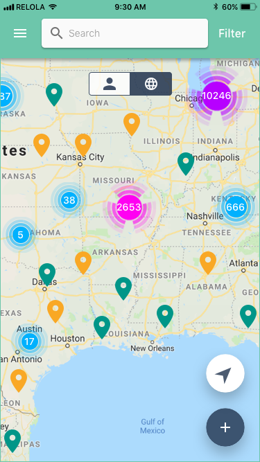
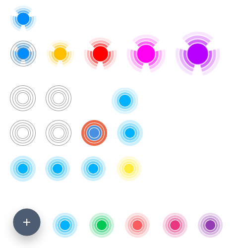
Map Iconography
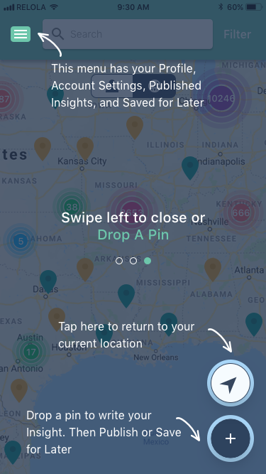
In order to make the map less overwhelming to Relola’s users and to encourage them in participating by adding new pins and insights to the map, I created a tab that showed users’ personal activity in focus and all Relola’s users’ activities in whole.
Since we were using Google Map’s API, we were also able to use its grouping feature to get a cleaner and a less overwhelming first view of highly populated areas on the map. I downloaded the icons from Google Developer’s GitHub page and found out that Google is using the icons to group the pins in categories of single digits (m1), two digits (m2), three digits (m3), four digits (m4), and five and over five digits (m5).
I recreated m1 to m5 icons, by giving them a better appearance and customizing them for Relola using our branding colors. Since I needed more colors to support the grouping feature, I added mat pink, purple, blue, and green, and convinced the marketing team to accept them by referring to them as “unicorn colors”. The result was a less crowded and cleaner view of the map on the first view and the users had the option of digging deeper if they desired. We used micro interactions to animate the pins coming out of the groups and spreading on the map once users would tap on m1 to m5 icons.


Bubble Tour
I then used the location of the three welcome screens I mentioned during my Heuristic Evaluation to explain how users could easily interact with the App in three simple steps.


InVision Prototypes
I transferred the screens to InVision App and created two prototypes for the iOS and Android Mobile Apps.
Zeplin Specs
I created the specs for both iOS and Android screens using Zeplin and shared that with the Engineers.
Push Notifications
Do you remember that BJ Fogg’s theory I talked about earlier? After we created a solution to motivate our users and give them the ability to use the App better, we needed to also find a way to trigger them so that they would adopt Relola as one of their daily routines as the modern Real Estate Agents. We used Mixpanel to send push notifications on both our iOS and Android Native Apps, as well as studying our user behaviors moving forward. With Mixpanel’s AI, we would be able to send more personalized notifications to users and increase their user engagement even further.


Impact
Upon launching the new version of the App, Relola was able to increase the number of its users as well as the number of insights that each user created on the App.
Later Developments
While we were able to increase the user engagement in Relola’s iOS and Android Apps, its main users still had the concern of not wanting to share their insights with their competitors before they seal the deals, which was a valid concern. This has made Relola to try other horizons and expand the audience of their Apps to other demographics, including concert and festival attendees who might want to gather their insights and share it with one click to their social media for their friends and family to see and be inspired by, travel enthusiasts, service provider companies, medical facilities that share expensive equipments, etc.